BFA SENIOR
EXHIBITION
2024
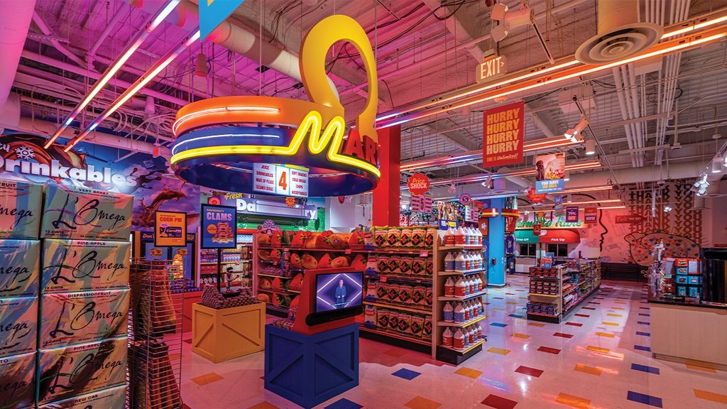
Welcome to The Mart of 8th Ave, where satire meets design in a keen exploration of misleading products. In a world overwhelmed with deceptive marketing tactics, The Mart of 8th Ave challenges us to question the authenticity of the products we encounter daily.


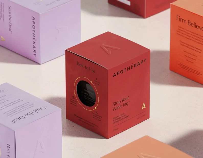
I wanted to challenge myself and use everything I’ve learned and packaging design was versatile to show my skill set and my love for crafting.
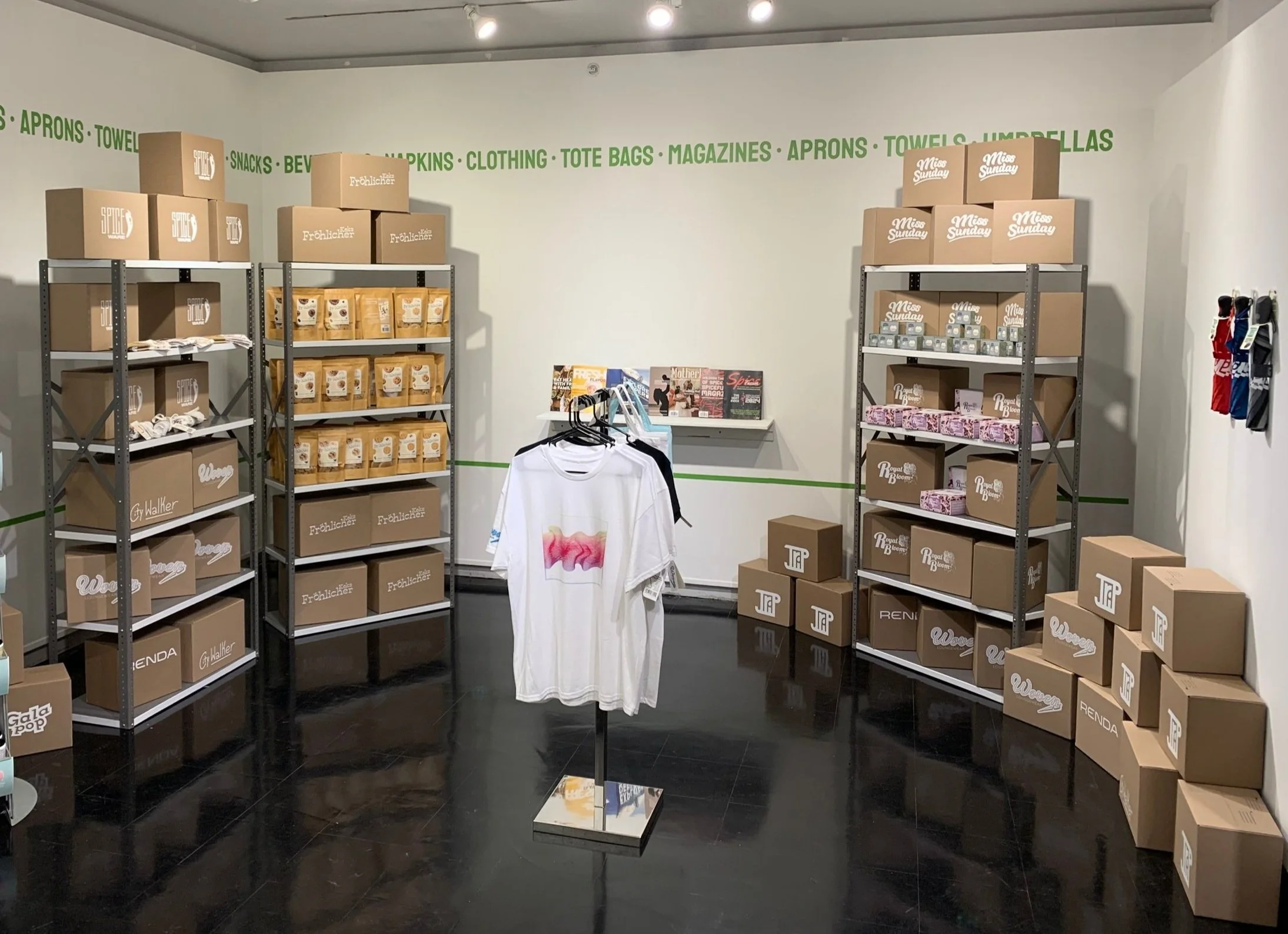


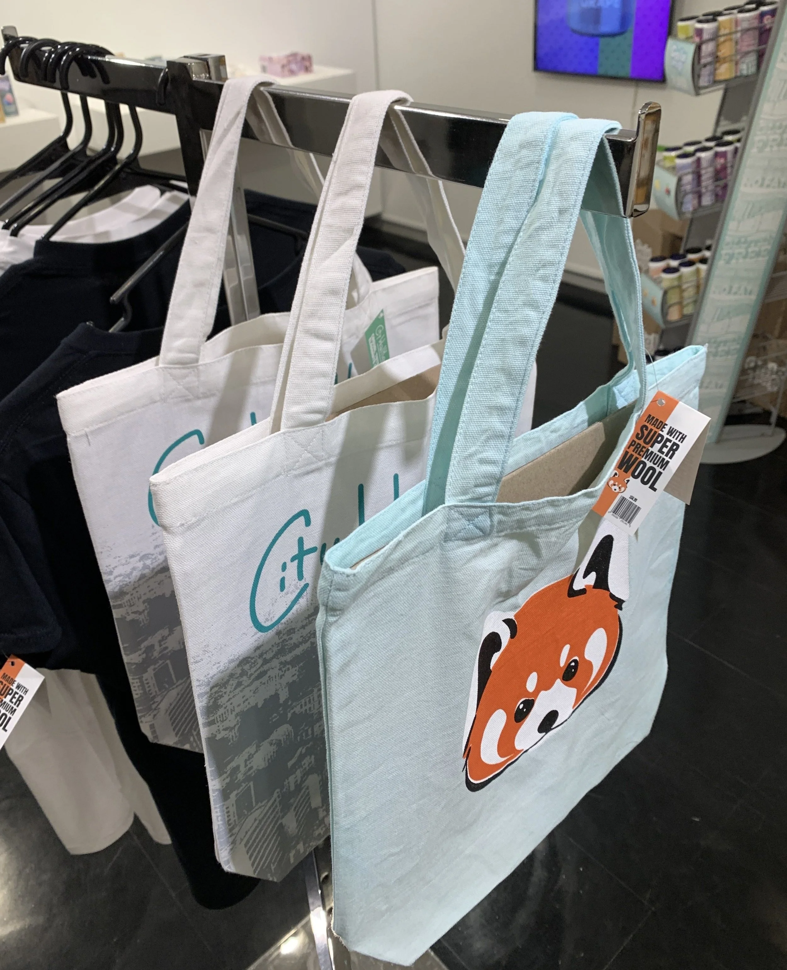
I wanted the overall look of the store to feel bold before even seeing it up close. The design choice of the packaging was making it feel expensive and natural. My products were either made with screen printing or digitally printed or both.

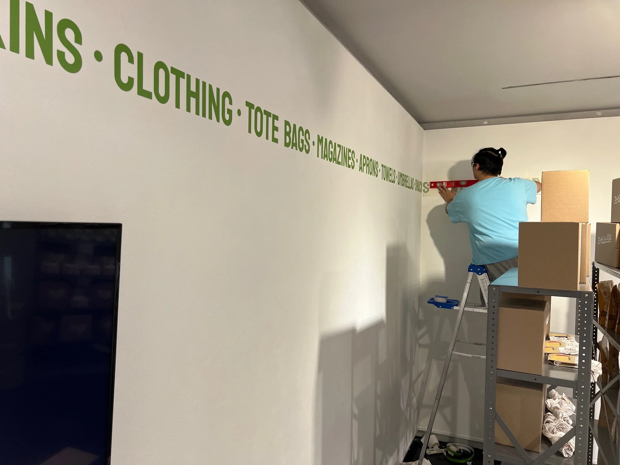


The name of my corner store was based on where my grandparents lived in New York and there were tons of corner stores there with tight spaces that influenced my show space in a gallery.
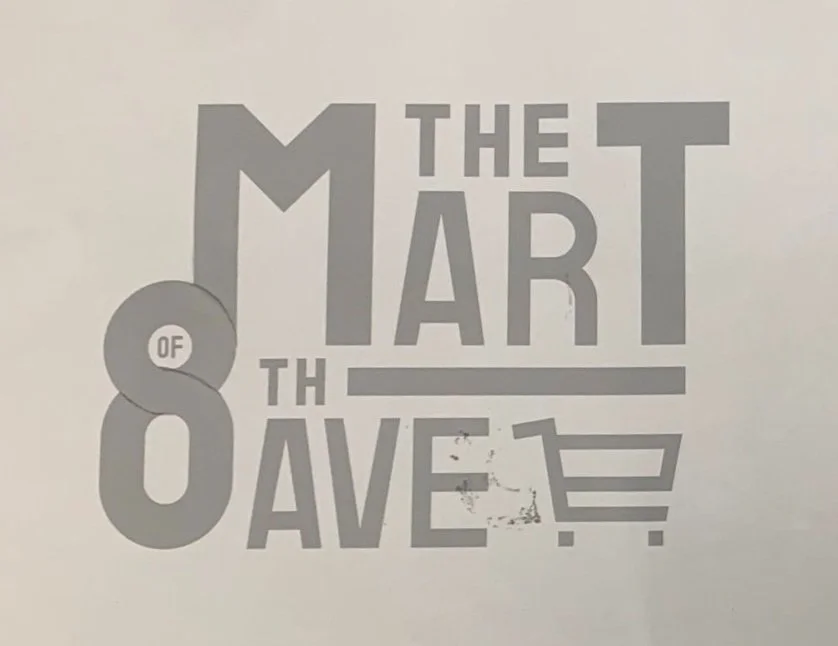
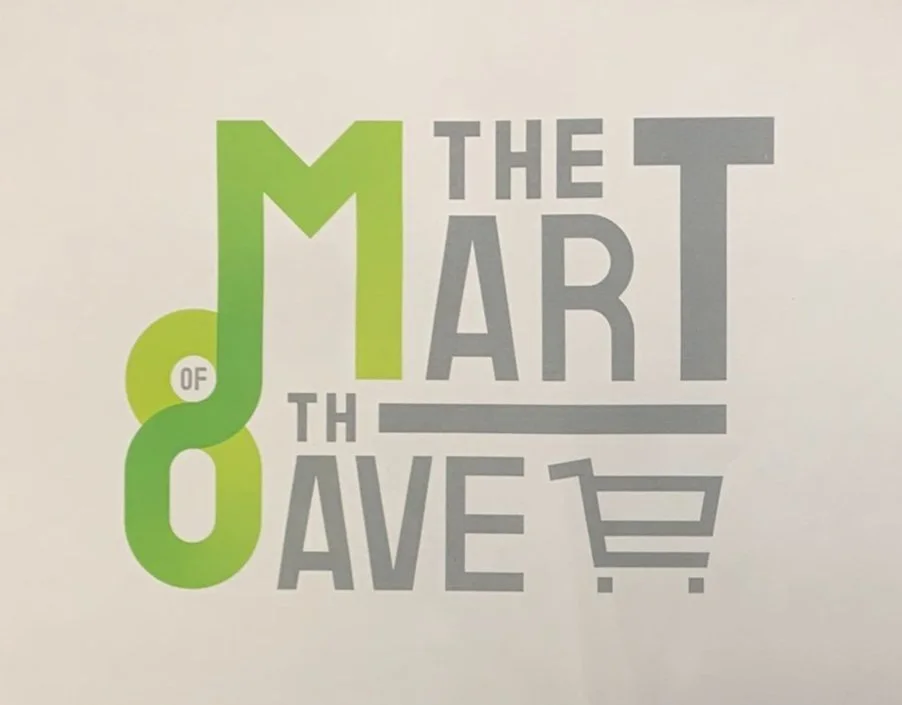
The logo of my store was created on a grid and I mapped it out on paper to see what kind of gradient flow worked best in my design. For the poster I wanted it to look like a flyer advertisement for the store and some of it’s products in it.


My inspiration were Omega Mart and Kati Forner because of their clean and attention grabbing typography and design.